
 A group of design experts have given advice over the best and worst fonts to use for a CV
The simple CV, usually a history of work and achievements may not be something that many people take too much thought about the design, but the font used can be a place for people to express themselves. Bloomberg asked three people who spend most of their time looking at typography whether the font you use can have a negative effect on the chances of getting an interview.

Attention Recruiters
See Live Jobs on SplitFee.org – Don’t Miss Out
It’s FREE if you Join Now!
The best font for a CV, Bloomberg suggests, is Helvetica with the font being a consensus winner amongst the experts.

“Helvetica is so no-fuss, it doesn’t really lean in one direction or another. It feels professional, lighthearted, honest,” says Brian Hoff, creative director of Brian Hoff Design. “Helvetica is safe. Maybe that’s why it’s more business-y.”
The expects, including the creative director of a brand consultancy, suggest that candidates don’t use an imitation if they are looking for a design job, as the experts can see a knock-off font when they see one. 
If you fancy splashing out on fonts, then the experts suggest going with Proxima Nova, which they say is ‘a cousin to Helvetica’ and less of an edge. However with the entire font family costing $734 it might be a little pricy for customising a CV.
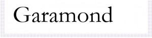
Other options for font include Garamond, which will allow a candidate to fit a long rap sheet onto a single page. The experts suggest that it is ‘easy for the eye to follow’.

The classic Times New Roman may send the wrong message to those with the hiring decision, with experts claiming that ‘It’s like putting on sweatpants” and that a candidate didn’t put any thought into the typeface selected.

Courier is another font that should be avoided, with the experts suggesting that “You don’t have a typewriter, so don’t try to pretend that you have a typewriter”.

One font that should be avoided at all costs, the experts say, is Comic Sans. Hoff says that the only time the font should be seen on a CV is if a candidate is applying to ‘clown college’.