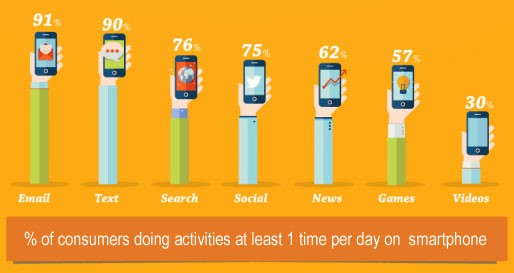
 It is clear from these statistics that a mobile devices are fast becoming preferred over a PC
The world of email marketing is fast paced and constantly evolving.
In 2014 there was over 294 billion emails sent and received on a daily basis.
65% of those emails were opened on a mobile device, 53% of which were opened on a smart phone.
It is clear from these statistics that a mobile devices are fast becoming preferred over a PC, and let’s be honest it is easy to see why, you can obtain instant access to the information you want, anywhere at any time – commuting to work, on your lunch break, even waiting in line at the cinema.
With this in mind, mobile optimising your website and email designs is now no longer a consideration, it is a necessity.
69% of mobile users delete emails that are not optimised for a mobile device.
When planning your B2B email campaigns, keep in mind the following when creating your email design and landing pages:
1 – Is it user friendly? – There is nothing worse than opening an email on your phone and having to either squint to read the text or have to mess around with your settings to be able to read the text.
2 – Is your call to action clear? – Ensure your design draws the reader’s attention to your key selling points, with a link going direct to your website or landing page.
3 – Rule of thumb – When creating a mobile optimised design, ensure the links or call to action buttons are of adequate size for the reader’s finger / thumb without having to zoom in on the design.
4 – Subject lines – Keep your subject lines short to prevent losing half the message you are trying to convey, a good rule to keep is an average of 15 characters long. Tip – A super subject line / pre-header is a great way of increasing your open rate.
5 – Test – Before sending your email design look at it on different operating systems, such as android and iOS – can you read it easily, if not do not send it until you have the layout right.
Get The Recruiting Times FREE every Monday – SUBSCRIBE NOW
Recruiters love this COMPLETE set of Accredited Recruitment & HR Training – View Training Brochure


